give me my screen back
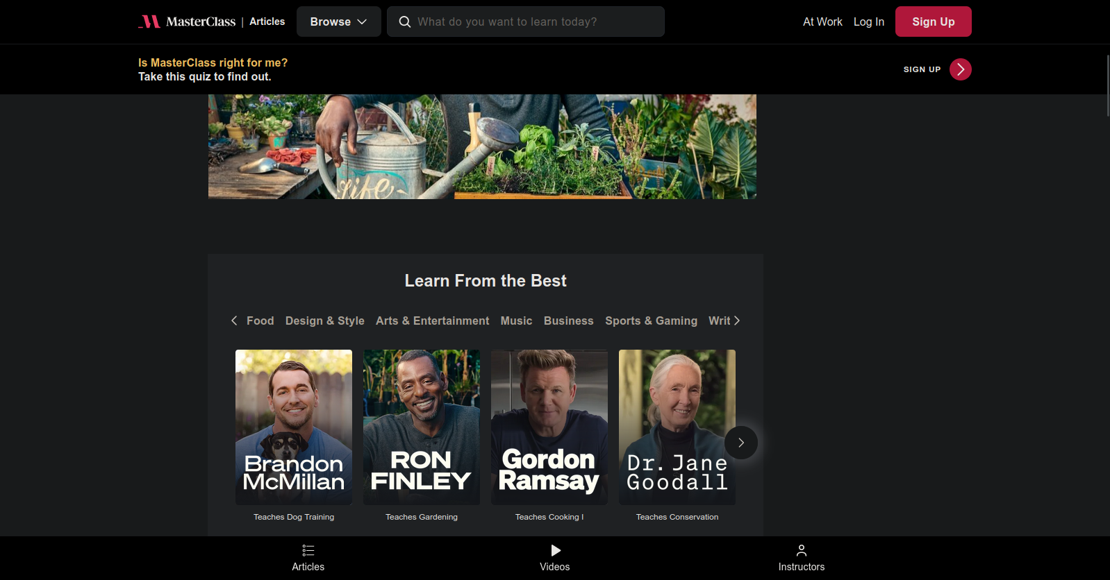
i rembered why i made this page. today's offender is masterclass.com. if you navigate to any article (idk if you can do that from home page, add /articles at the end) you may notice that if you scroll down just a bit there are a lot of sticky elements on the site.
they take up 25% OF MY BROWSER'S SPACE. that's only the rendered area - i don't include address bar and windows taskbar (there are no tabs to not include bc i use vertical ones).
so, what is on these banners? surely if they take up so much space they must convey a lot of useful information/actions that user may take?
on the top we have the usual suite: site's logo, search bar and log in buttons. kinda high, but acceptable.
next, still on the top: "Is MasterClass right for me? Take this quiz to find out". not only this is useless and could have been placed on the right side of the article, but you cannot select the text (what if user clicks on it instead of the button on the right?? we better make the entire banner one single button) so i had to type it out by hand.
finally, bottom navigation bar. there are three options: articles, videos and instructors. it might have made sense to have those (not here, in the flyout at the top) but interesting thing happens if you click on videos or instructors. it takes you to the main page. yes, both of them take you to the main page. you can't even go back to articles by bottom navigation again, because it doesn't exist.
i am sure this is not the worst example, but it is the one i've encountered.
